Takina
Takina
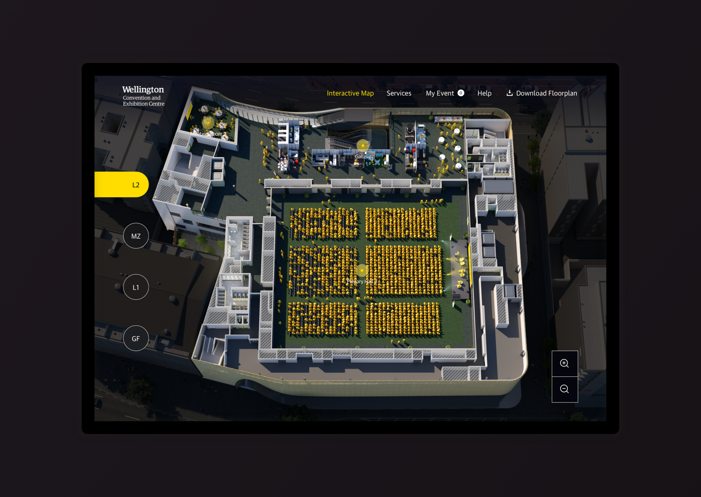
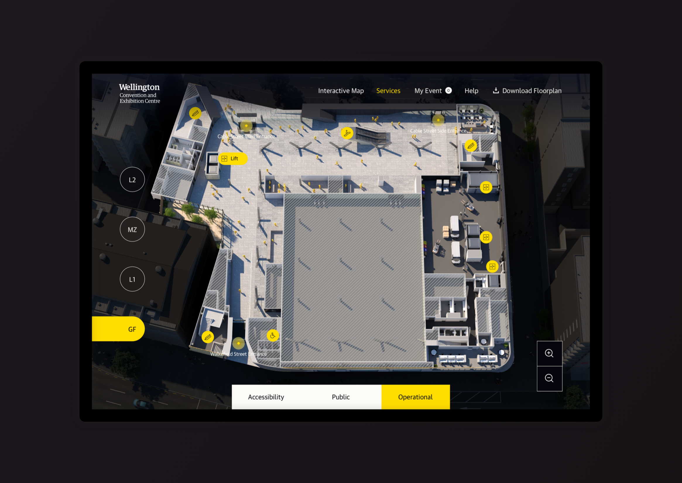
Goal: Support the Takina sales team through online and interactive experience that helps prospective clients explore and imagine how the WCEC can be configured for their event.
We started by analyzing the existing app and identifying areas for improvement. One major issue was the disjointed user experience: while configuring a space would update the map, there was no clear indication of whether the setup was saved. Additionally, users had to repeat actions unnecessarily, making tasks cumbersome. To enhance usability for conference organizers and event planners, we aimed to streamline the configurator process, making event modelling simpler and more efficient.
The loading screen showcases a high-resolution image of the building, enhancing its authenticity and appeal to both domestic and international event planners. With no navigation options, users are drawn to the prominent "play video" button, providing a glimpse into the center's appearance and location in Wellington.
Following research and discussions with the team, I prioritize incorporating familiar design patterns and grouping features by function across the user journey. These include notifications, tabs, top navigation, and tooltips. By leveraging common patterns, we aim to reduce the learning curve for users, making navigation more intuitive and efficient.


